Column guide
🔥🔥
This article has been included in100 Days to Python Mastery from Entry to Career.: This column is dedicated to the zero base and the need to advance to improve the students to prepare a complete set of teaching, from 0 to 100 of the continuous advancement of the depth of the follow-up and the actual project, easy to deal with the interview, the column subscription address:https://blog.csdn.net/yuan2019035055/category_11466020.html
- vantage:Subscribe to a limited time 9.9 paid columns into the thousands of full-stack VIP Q&A group, the author priority answer opportunities (code guidance, remote services), the group of big brother many can hold the warmth of the group (the big factory push opportunities)
- Column Benefits:Resume coaching, recruiting insider, weekly delivery of physical books, 80G full-stack learning videos, 300 IT e-books: Python, Java, front-end, big data, databases, algorithms, crawlers, data analytics, machine learning, interview question bank and more!


1. What is the water polo chart?
A Waterfall chart is a data
visualization chart used to show the increase or decrease of a series of data and to highlight the extent to which each data item contributes to the overall change. It is usually presented as a bar chart, where each data item is represented by a vertical bar, the length of which indicates the magnitude of the value of the data item, with a rising bar indicating an increasing data item and a falling bar indicating a decreasing data item. The water balloon chart can also distinguish between increasing and decreasing data items by different colors or shading, thus showing the change of data more visually.

2. Scenarios for the application of the hydrograph
Water balloon diagrams are often used in the following scenarios:
- Financial Analysis: The water balloon chart can be used to show the changes in the company’s revenue, cost, profit and other financial indicators, helping analysts and managers quickly understand the impact of each data item on the overall financial situation.
- Sales Analytics: Water balloon charts can be used to show changes in sales, sales volume, and other metrics to help sales teams understand how individual products or regions are selling and identify reasons for sales growth or decline.
- Project Management: The water balloon diagram can be used to show the changes in the project’s budget, cost, schedule and other indicators to help project managers understand the execution of the project, and adjust resource allocation or take measures to achieve the project goals in a timely manner.
- Comparative analysis: Water balloon charts can be used to compare data changes over time, across products or across regions, helping users to visualize the differences between individual data items and quickly identify key factors.
- Goal Setting: The water balloon diagram can be used to set goals and make plans. By showing the gap between the current state and the target state, it helps users to clarify their goals and make corresponding action plans.
Overall, water balloon charts can help users better understand the trends and influencing factors of the data to make more accurate decisions and planning.
II. Configuration options for water polo chart classes
1. Introduction of packages
from pyecharts import options as opts
from pyecharts.charts import Liquid
2. The Liquid class
class Liquid(Chart):
    """
    <<< Liquid >>>
    Liquid graphs are primarily used to highlight percentages of data.
    """

    def __init__(
        self,
        # Initialize the class
        init_opts: types.Init = opts.InitOpts(),
        render_opts: types.RenderInit = opts.RenderOpts(),
    )
3. add function
The add function mainly configures the name, data, shape, color and label configuration items:
def add(
    self,
    series_name: str, # name of the data series
    data: types.Sequence, # Sequence of data, used to represent the percentage data of the liquid map
    *,
    shape: str = "circle", # the shape of the liquid map, defaults to circle
    color: types.Optional[types.Sequence[str]] = None, # the color of the liquid map, which can be a sequence of colors
    background_color: types.Union[str, dict, None] = None, # the background color of the liquid map, which can be a color string, a dictionary, or None
    is_animation: bool = True, # Whether to enable animation, default is True
    is_outline_show: bool = True, # Whether to show the outer border, default is True
    outline_border_distance: types.Numeric = 8, # distance of the outer border from the liquid map, defaults to 8
    outline_itemstyle_opts: types.ItemStyle = None, # Style configuration item for the outer border
    center: types.Sequence = None, # the center of the liquid map, defaults to None
    tooltip_opts: types.Tooltip = None, # Configuration items for tooltips
    label_opts: types.Label = opts.LabelOpts(font_size=50, position="inside"), # Configuration item for labels, default font size is 50, position is inside
)
Third, the water balloon diagram of the actual
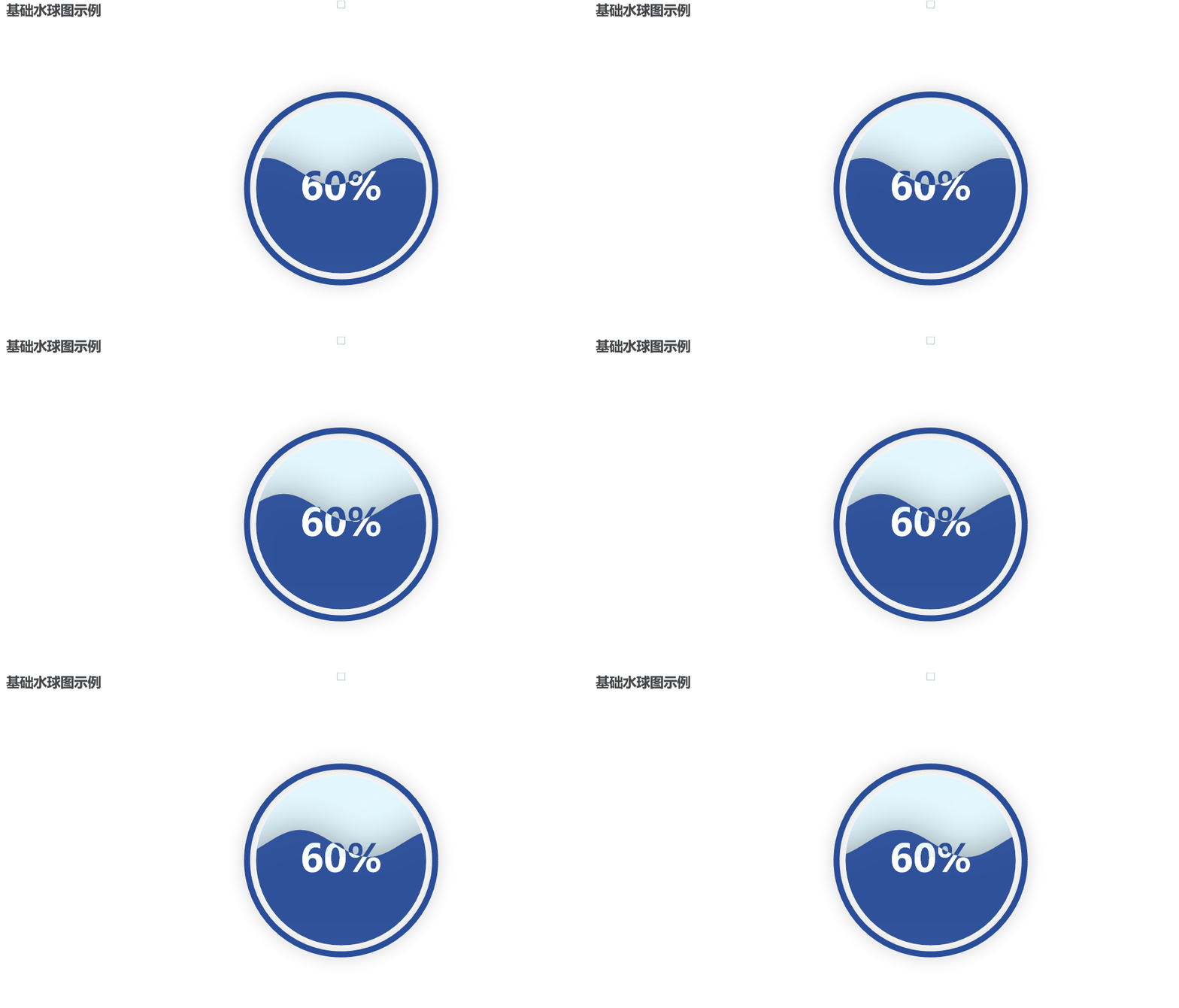
1. Basic water balloon diagram
In the code, use the
Liquid()A Liquid instance object is created. Then use the
.add()method to add data, here the data is 0.6, which means that the liquid map is 60%. Finally, use the
.set_global_opts()method sets the global configuration of the chart, such as the title. Finally, set the global configuration of the chart via the
.render()method renders the chart as an HTML file:
from pyecharts.charts import Liquid
from pyecharts import options as opts

# Create a Liquid instance object
liquid = (
    Liquid()
    .add("Liquid", [0.6]) # add data, here the data is 0.6, which means the liquid map is 60% of the map
    .set_global_opts(title_opts=opts.TitleOpts(title="Example of a basic water polo chart")) # Set title
)

# Render HTML files
liquid.render("basic_liquid_chart.html")
# Displayed in Jupyter Notebook
liquid.render_notebook()
Run results:

2. Rectangular hydrograph
utilization
from pyecharts.globals import SymbolTypeThe following graphs can be plotted:
- RECT: Rectangular
- ROUND_RECT: Rounded Rectangle
- TRIANGLE: Triangle
- DIAMOND:Rhombus
- ARROW: Arrow-shaped
Note: When passing a parameter, all the English above should be capitalized!
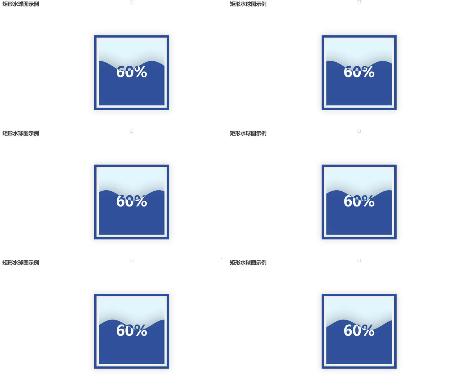
Drawing a rectangular water balloon map will add to the add function the
shape=SymbolType.RECTparameter is sufficient:
from pyecharts.charts import Liquid
from pyecharts import options as opts
from pyecharts.globals import SymbolType

# Create a Liquid instance object
liquid = (
    Liquid()
    .add("Liquid", [0.6], shape=SymbolType.RECT) # add data, here the data is 0.6, which means that the liquid map is 60% of the map
    .set_global_opts(title_opts=opts.TitleOpts(title="Example of a Rectangular Water Globe Chart")) # Set title
)

# Render HTML files
liquid.render("Example of a rectangular water balloon diagram.html")
# Displayed in Jupyter Notebook
liquid.render_notebook()
Run results:

3. Circular angular rectangular water sphere diagrams
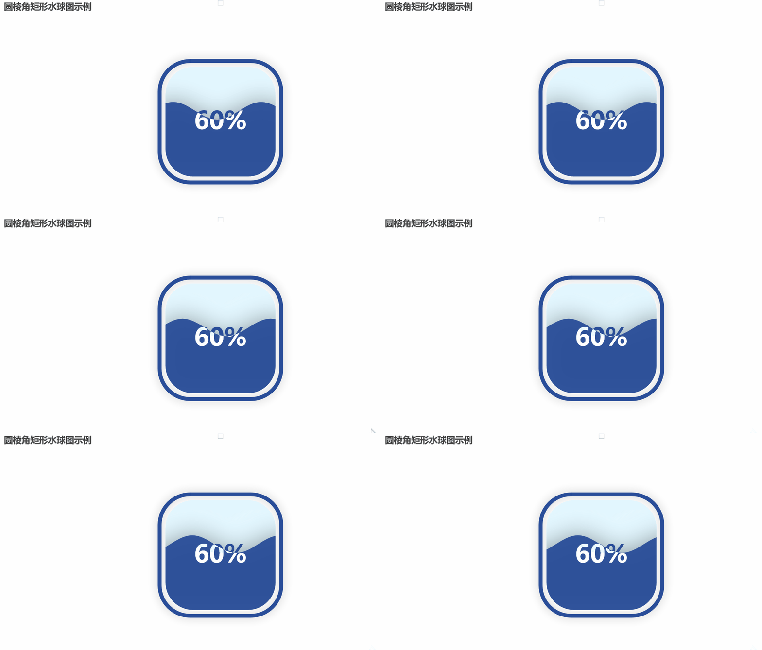
Drawing a rounded rectangle water sphere will add to the add function.
shape=SymbolType.ROUND_RECTparameter is sufficient:
from pyecharts.charts import Liquid
from pyecharts import options as opts
from pyecharts.globals import SymbolType

# Create a Liquid instance object
liquid = (
    Liquid()
    .add("Liquid", [0.6], shape=SymbolType.ROUND_RECT) # add data, here the data is 0.6, which means that the liquid map is 60% of the map
    .set_global_opts(title_opts=opts.TitleOpts(title="Example of a rounded angular rectangular water globe diagram")) # Set title
)

# Render HTML files
liquid.render("Example of a rounded rectangular water balloon diagram.html")
# Displayed in Jupyter Notebook
liquid.render_notebook()
Run results:

4. Triangular water balloon diagram
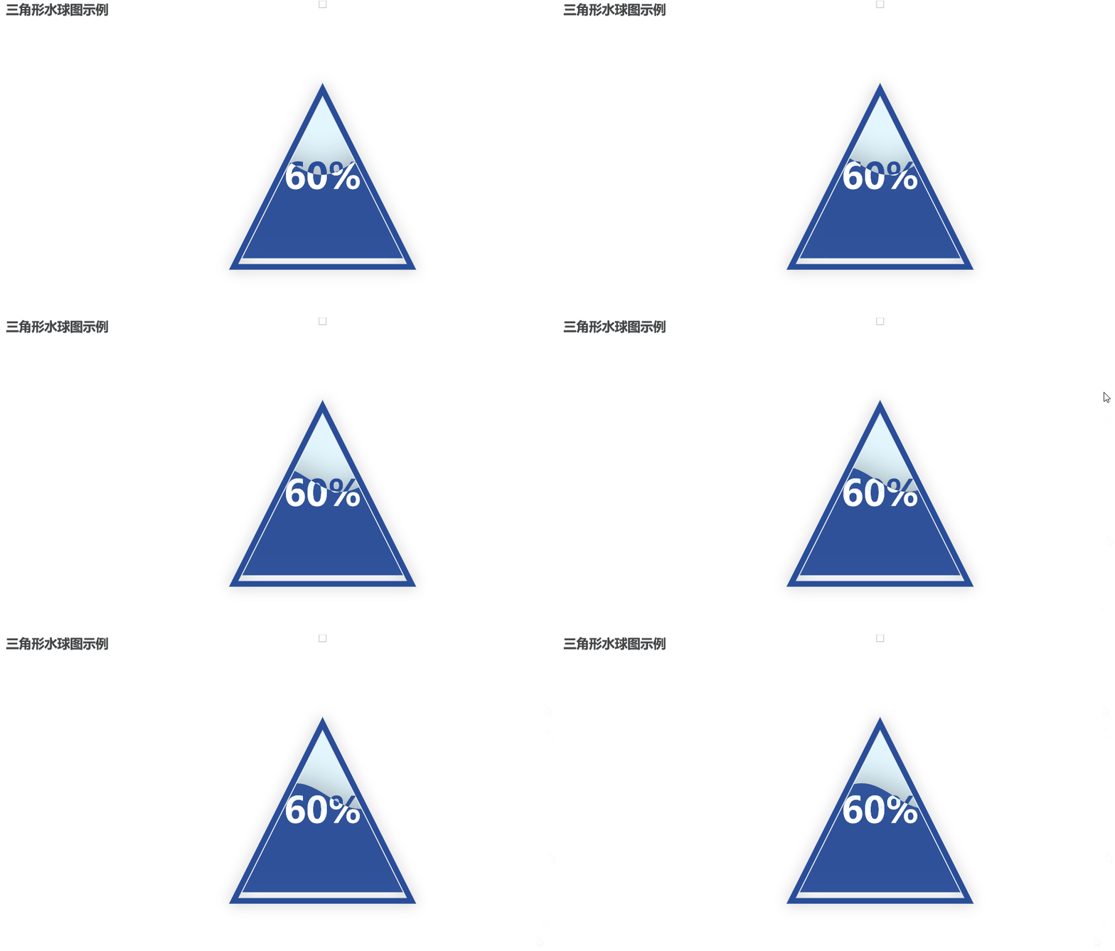
Drawing a triangular water balloon map will add to the add function the
shape=SymbolType.TRIANGLEparameter is sufficient:
from pyecharts.charts import Liquid
from pyecharts import options as opts
from pyecharts.globals import SymbolType

# Create a Liquid instance object
liquid = (
    Liquid()
    .add("Liquid", [0.6], shape=SymbolType.TRIANGLE) # add data, here the data is 0.6, which means that the liquid map is 60% of the map
    .set_global_opts(title_opts=opts.TitleOpts(title="Example of a triangular water balloon diagram")) # Set the title
)

# Render HTML files
liquid.render("Example of a triangular water balloon diagram.html")
# Displayed in Jupyter Notebook
liquid.render_notebook()
Run results:

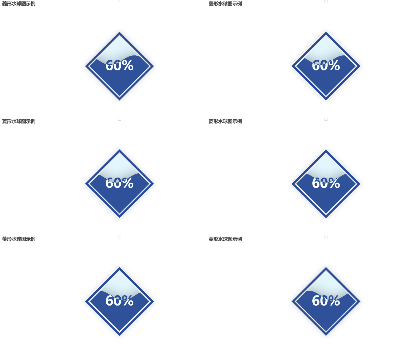
5. Rhombic water balloon diagram
Adding to the add function
shape=SymbolType.DIAMONDparameter to draw a diamond-shaped water sphere:
from pyecharts.charts import Liquid
from pyecharts import options as opts
from pyecharts.globals import SymbolType

# Create a Liquid instance object
liquid = (
    Liquid()
    .add("Liquid", [0.6], shape=SymbolType.DIAMOND) # add data, here the data is 0.6, which means that the liquid map is 60% of the map
    .set_global_opts(title_opts=opts.TitleOpts(title="Example of a diamond shaped water balloon diagram")) # Set title
)

# Render HTML files
liquid.render("Example of a diamond-shaped water balloon diagram.html")
# Displayed in Jupyter Notebook
liquid.render_notebook()
Run results:

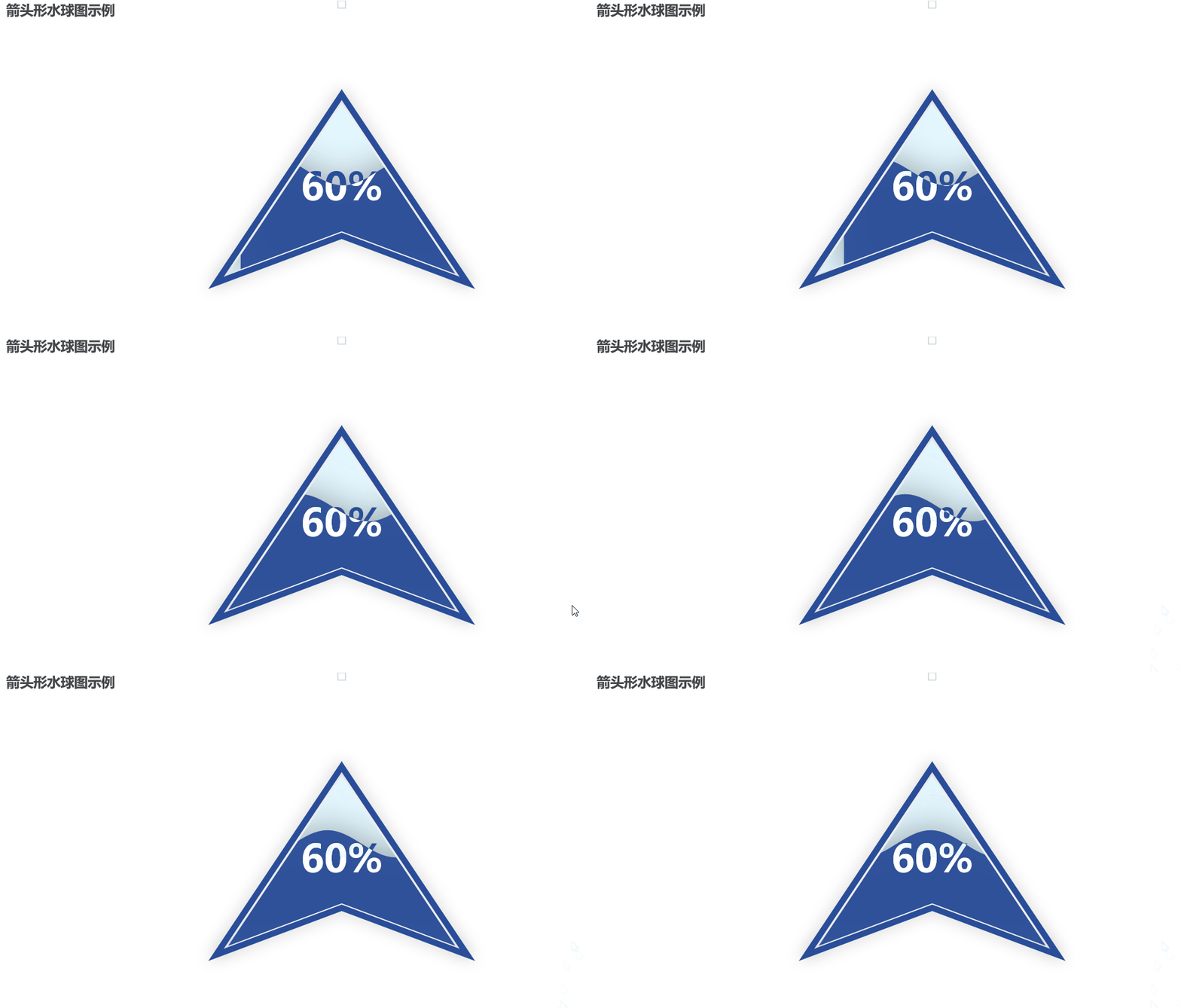
6. Arrow-type water balloon diagrams
Adding to the add function
shape=SymbolType.ARROWparameter to draw an arrow-shaped water sphere:
from pyecharts.charts import Liquid
from pyecharts import options as opts
from pyecharts.globals import SymbolType

# Create a Liquid instance object
liquid = (
    Liquid()
    .add("Liquid", [0.6], shape=SymbolType.ARROW) # add data, here the data is 0.6, which means that the liquid map is 60% of the map
    .set_global_opts(title_opts=opts.TitleOpts(title="Arrow shaped water balloon chart example")) # Set title
)

# Render HTML files
liquid.render("Arrow-shaped water balloon diagram example.html")
# Displayed in Jupyter Notebook
liquid.render_notebook()
Run results:

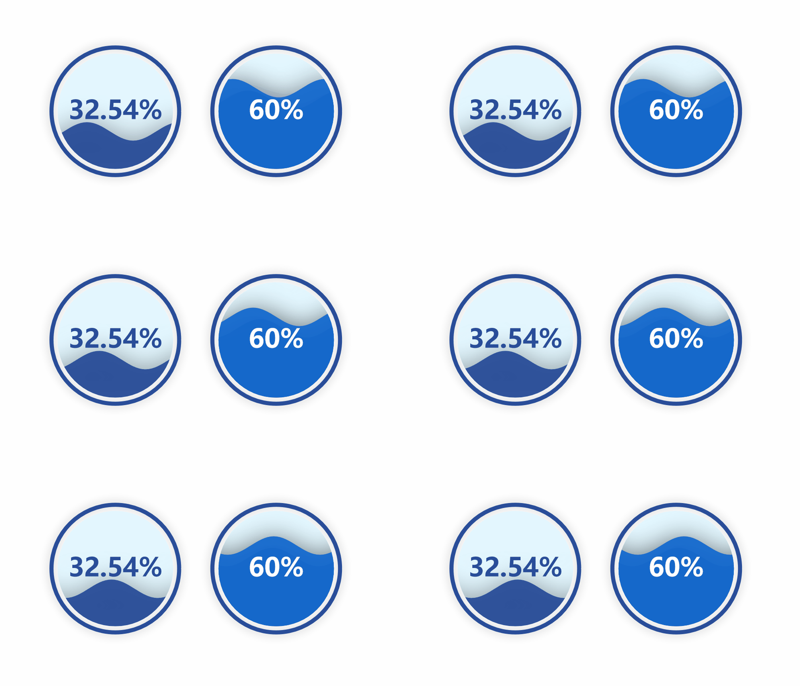
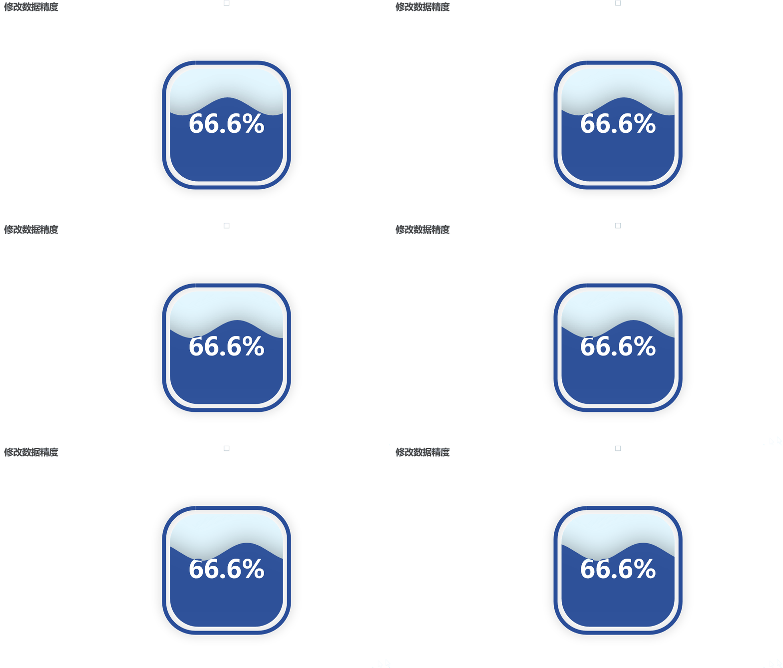
7. Modification of data accuracy
By setting the formatter parameter and using the JsCode module, you can customize the label’s formatting function to convert the data into percentage form:
from pyecharts import options as opts # Import configuration items module
from pyecharts.charts import Liquid # From Pyecharts. Charts import liquid #
from pyecharts.commons.utils import JsCode # Import the JsCode module
from pyecharts.globals import SymbolType # Import symbol type module

# Create a Liquid instance object
liquid = (
    Liquid()
    .add(
        "lq",
        [0.6666], # Add the data for the water balloon graph to four decimal places (or you can keep adding more data)
        label_opts=opts.LabelOpts(
            formatter=JsCode(
                """function (param) {
                    return (Math.floor(param.value * 10000) / 100) + '%';
                }"""
            ), # Set the label's formatting function to convert the value to percentage form
            position="inside", # set the label to show inside the water globe
        ),
        shape=SymbolType.ROUND_RECT # Set the shape of the water globe image to rounded rectangle
    )
    .set_global_opts(title_opts=opts.TitleOpts(title="Modify Data Precision")) # Set the title of the chart
)

# Render HTML files
liquid.render("Modify Data Accuracy.html")
# Displayed in Jupyter Notebook
liquid.render_notebook()
Run results:

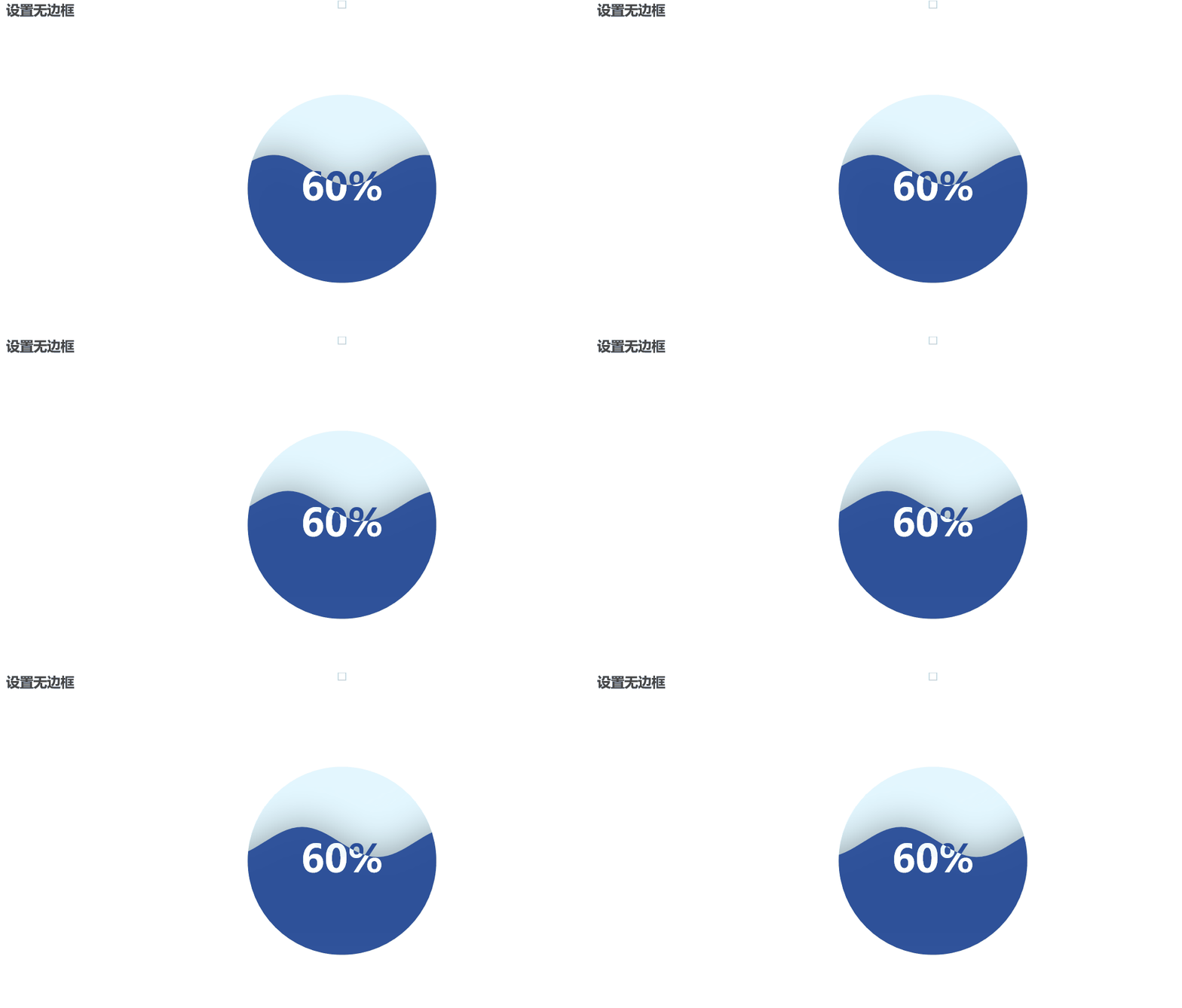
8. Setting up borderless
Adding to the add function
is_outline_show=Falseparameter to set no border:
from pyecharts.charts import Liquid
from pyecharts import options as opts
from pyecharts.globals import SymbolType

# Create a Liquid instance object
liquid = (
    Liquid()
    .add("Liquid", [0.6], is_outline_show=False) # add data, here the data is 0.6, which means that the liquid map is 60% of the map
    .set_global_opts(title_opts=opts.TitleOpts(title="Set borderless")) # Set title
)

# Render HTML files
liquid.render("Example of setting up a borderless water balloon graphic.html")
# Displayed in Jupyter Notebook
liquid.render_notebook()
Run results:

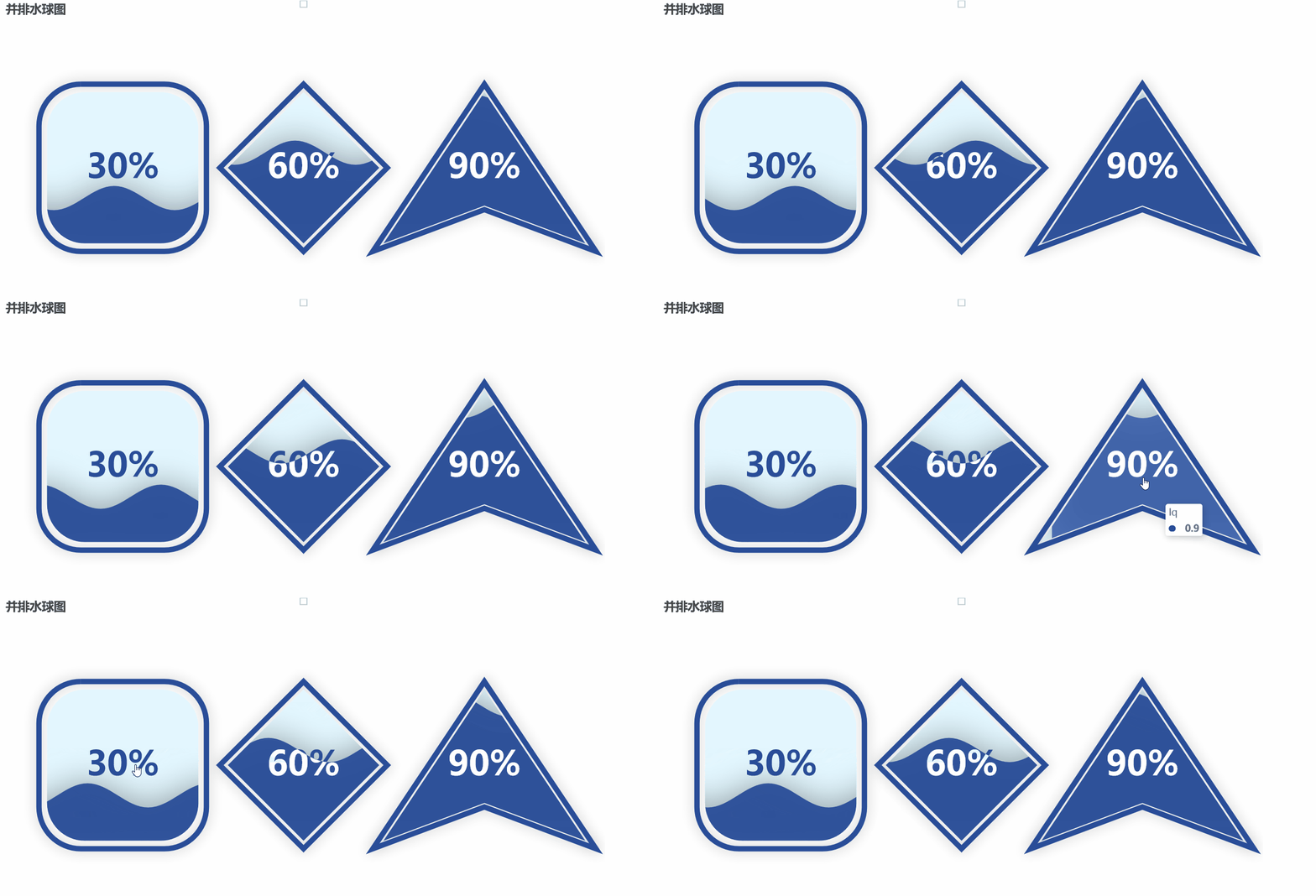
9. Multiple side-by-side water balloon diagrams
First, three separate water globe map objects were created, each representing a water globe map with different data, position and shape set. Then, a grid object was created and the three water globe map objects were added to the grid using the .add() method. Finally, the grid was rendered as an HTML file using the .render() method and the grid chart was displayed in Jupyter Notebook using the .render_notebook() method:
from pyecharts import options as opts # Import configuration items module
from pyecharts.charts import Grid, Liquid # From Pyecharts. Charts import Grid, liquid #
from pyecharts.globals import SymbolType # Import symbol type module

# Create the first water sphere diagram object
l1 = (
    Liquid()
    .add("lq", [0.3], center=["20%", "50%"], shape=SymbolType.ROUND_RECT) # Add the data and configuration for the water globe map, set to a rounded rectangle shape
    .set_global_opts(title_opts=opts.TitleOpts(title="Side-by-Side Water Balloon Chart")) # Set the title of the water balloon chart
)

# Create a second water sphere diagram object
l2 = (
    Liquid()
    .add("lq", [0.6], center=["50%", "50%"], shape=SymbolType.DIAMOND) # Add the data and configuration for the water balloon graph, set to a diamond shape
    .set_global_opts(title_opts=opts.TitleOpts(title="")) # Set the title of the water globe chart to empty
)

# Create a third water sphere diagram object
l3 = (
    Liquid()
    .add("lq", [0.9], center=["80%", "50%"], shape=SymbolType.ARROW) # Add the data and configuration of the water balloon graph, set to an arrow shape
    .set_global_opts(title_opts=opts.TitleOpts(title="")) # Set the title of the water globe chart to empty
)

# Create a mesh object and add the water sphere map object to the mesh
grid = Grid().add(l1, grid_opts=opts.GridOpts()).add(l2, grid_opts=opts.GridOpts()).add(l3, grid_opts=opts.GridOpts())

# Render HTML files
grid.render("Side-by-side water balloon chart.html")
grid.render_notebook()
Run results:
